How to Build a Reusable Style Pack for AI Images
A style pack is the difference between re-describing your brand every morning and applying it in one step. Here is how to build one that actually holds.
21 de septiembre de 2026
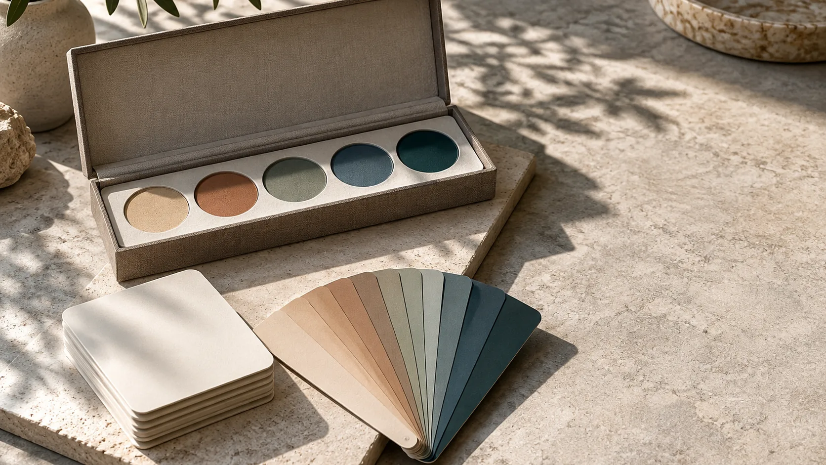
Every team that produces AI imagery repeatedly hits the same wall: the approved look exists in a folder of images, but it does not exist as anything reusable. So each new request starts with someone trying to remember the light, guessing at the palette and hunting for the prompt that worked in June. A style pack ends that loop by turning a taste decision into a saved, testable asset.
What belongs in a style pack
A pack is not a mood board and not a single prompt. It is a small set of constraints, each one specific enough to check in a finished image:
- Palette — three to five colours, described by material as well as hue: "warm oat paper, slate grey, faded terracotta accent"
- Light — direction, softness and temperature: "soft directional daylight from the left, no hard highlights"
- Framing habit — the repeatable composition rule: "subject right of centre, 40% negative space, nothing within 8% of the edge"
- Treatment — how surfaces read: "matte, visible grain, dry paper backdrop, no reflections"
- Negative list — what never appears: text, logos, watermark artefacts, chrome, neon, plastic sheen
Five groups. If a pack needs a sixth to be usable, the first five are probably too vague.
Derive the pack from images you already approved
The most reliable way to build a pack is backwards. Take eight to twelve approved images, put them side by side, and write down what repeats. Do not write down what you wish were true.
Three questions do most of the work:
- What colours appear in every frame, and which one is only ever an accent?
- Where does the light come from, and how soft is the shadow it makes?
- What is the subject's relationship to the frame — centred, offset, tight, wide?
The answers become the pack. This is faster than inventing a look from scratch and far more likely to match reality, because it is describing work that already convinced you.
If you have no approved images yet, generate ten candidates from one detailed visual brief, approve the strongest three, and derive the pack from those. Build the taste first, then freeze it.
Name and version the pack
Packs accumulate, and unnamed packs rot. Use a naming scheme that says what the pack is for and when it changed:
studio-hero-matte-v1, studio-hero-matte-v2, social-editorial-warm-v1
Version when the palette, light direction or treatment changes. That is a different look and it should be a different pack, even if it is a small shift. Do not version when only the subject changes — that is a new brief using the same pack.
Keep the pack beside the assets it produced, not in a separate document nobody opens. The pack and its approved output are one artefact.
Test the pack on three subjects
A pack is only proven when it survives subject changes. Run it on three different jobs before trusting it in production:
- An object — the product, packaging or tool you sell
- A person — a portrait, team shot or character
- A texture or detail — a close crop of material, surface or ingredient
If the palette, light and treatment read the same across all three, the pack is stable. If the texture test drifts, the treatment line is too loose. If the person drifts, the light line is doing too little work.
This three-subject test is the cheapest quality gate in the whole workflow. It costs three generations and prevents a campaign's worth of corrections.
Why packs speed up production
The obvious benefit is speed: applying a pack is one step instead of re-describing a look in every prompt. The less obvious benefit is comparability.
When every asset in a campaign comes from one pack, review becomes a single question — is this on-pack? — instead of a debate about each image's individual merits. Teams that adopt packs usually find their revision count drops for a boring reason: there are fewer variables to disagree about.
Packs also make batch generation practical. Applying one set of constraints across a batch produces a contact sheet you can judge as a set, which is where drift becomes visible. Single-image review cannot show you drift; a batch can.
Where packs end and model choice begins
A style pack describes the look. It does not decide which model renders it. Different models handle light, materials and detail differently, which is why some studios route a single prompt across more than one model and compare the results — the approach behind smart routing.
Keep model notes separate from the pack. The pack should still be true if you switch models tomorrow; only the prompt translation changes.
Keep an accent discipline
The single most common reason a pack fails is accent inflation. One image uses terracotta for a small detail, the next for the whole background, the third for three separate objects. Each image is defensible, and the set looks scattered.
Decide the accent's maximum area in advance — a rough rule such as "no more than 10% of the frame" is enough — and apply it in review. That constraint, more than any style word, is what makes a set look art-directed rather than assembled.
Reuse the pack across formats and motion
Once a pack holds, extend it deliberately. Wide, square and vertical frames can all come from the same constraints with different crop notes. For video, carry the palette, light direction and treatment into the first frame and animate from there, so the still and the clip belong to the same world.
Start by generating one subject with the pack in the AI image generator, then run the three-subject test. A pack that survives an object, a person and a texture is ready to carry a whole campaign — and ready to hand to anyone on the team who needs the brand look without a briefing call.
Preguntas frecuentes
What is a style pack in AI image generation?+
A saved set of visual constraints — palette, light, treatment, framing habits and a negative list — that you can apply to any new subject so the result matches an approved look without rewriting the description each time.
How is a style pack different from a preset or a filter?+
A filter changes pixels after the fact. A style pack shapes the generation itself, so the light, materials and palette are built into the image rather than applied on top of it.
When should I create a new style pack instead of extending an existing one?+
Fork when the palette or light behaviour changes, because those carry brand recognition. Extend when only the subject category changes — for example adding a food subject to a pack built for products.
How many colours belong in a pack?+
Three to five, with one designated as the accent. More than five stops reading as a palette and starts reading as a random set of images.
Can one style pack serve both images and video?+
The palette, light direction and treatment carry over directly. Video adds motion and continuity requirements, so keep the pack's still version as the reference and add motion notes separately.
Hazlo con kublaro
Describe cualquier cosa y genera imágenes increíbles en segundos; después dales movimiento con los mejores modelos de video con IA.