How to Make AI Business Cards That Still Feel Human
Use AI for the visual foundation, then take control of the small details that make a business card feel credible in a hand.
16 de setembro de 2026
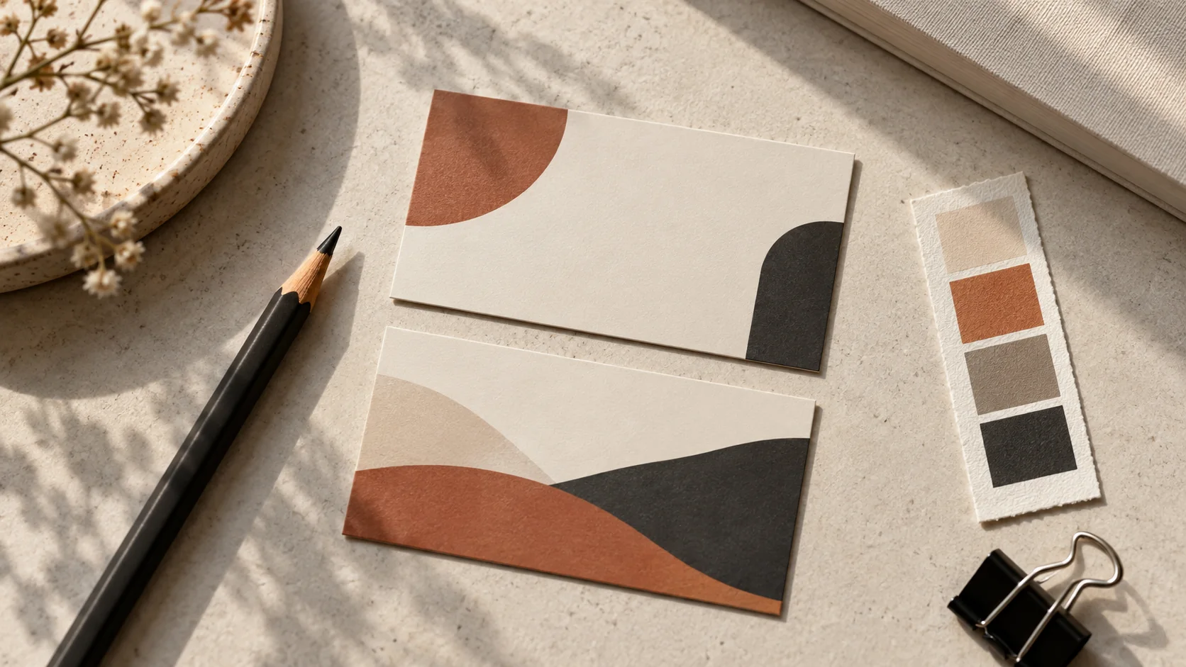
A business card has about two seconds to do its job: look credible, say what you do, and survive the pocket. Treat that as a design constraint, not a stopwatch. AI can get you to a sharp, on-brand direction quickly; the cards that feel human are the ones where someone still finishes the details deliberately.
Start with the card, not the prompt
Decide what the card must say before asking a model to decorate it: your name, role, one useful contact path, and the brand impression you want to leave — quiet luxury, friendly local, or bold creative. One focal idea per side beats a card trying to say everything. The AI business card maker builds the visual side from that brief with clean layouts, branded backgrounds and logo-friendly compositions generated from a single prompt.
Keep the first brief short enough to judge. If a reader needs to hunt for the name, understand the role, and find a way to continue the conversation, the card is carrying too much. Decide which detail is the invitation — a website, email address, booking link, or QR code — and let the rest support it.
Write a prompt like a creative brief
Name the field, the palette, and where things should sit. For example:
“Minimalist business card design for a freelance architect, warm off-white and charcoal, generous white space, logo top-left, room for name bottom-left.”
That prompt gives the generator a subject, a color relationship, a compositional rule, and a place for the identity to live. You can make it more expressive by adding one material or mood cue — uncoated paper, a restrained terracotta accent, or an understated editorial feel — but avoid piling on styles that compete.
Generate a small batch in a business-card aspect ratio and pick the most balanced layout, not the flashiest one. A card that looks calm at full screen will look confident at palm size. If you want to practice the same structure on other projects, the AI image prompting guide breaks a prompt into subject, setting, lighting, composition and style.
Design the back at the same time
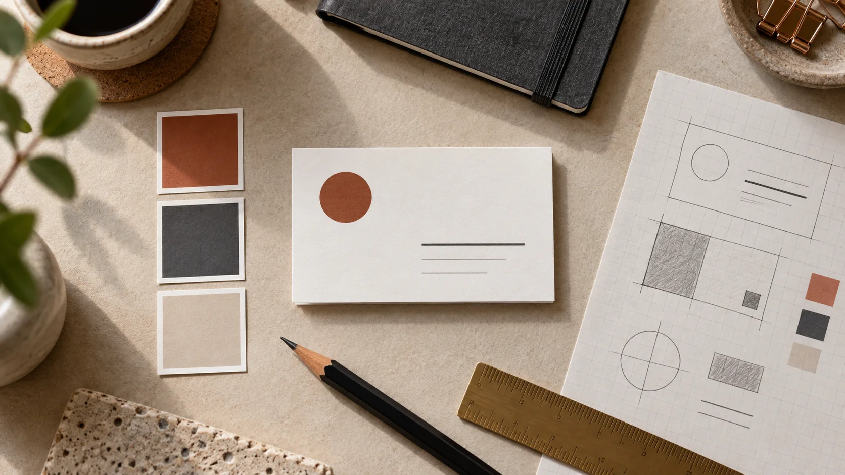
A two-sided card gives the identity room to breathe. Use a quiet front for your name, role and contact path; use the back for a logo, pattern, full-bleed brand color, or one line about what you do. Generate the back in a second pass with the same palette and style pack so the two sides read as one object rather than two unrelated graphics.
The front and back do not need equal visual weight. A nearly empty front paired with a more graphic back can work well, provided the repeated color, shape, or material cue makes the relationship obvious. Keep the prompts parallel: change the side-specific content, but hold the style language steady.
Finish the text outside the generator
AI is excellent at layout, color story, and atmosphere; exact letterforms at tiny sizes are where human control wins. Export at up to 4K, then set your name, title, and contact details as crisp text in any editor before sending the file to print. This is standard practical workflow, not a workaround — and it is where you catch typos while they are still free.
Before you export the final file, make four quick passes. Read the name and role first, check that the contact path has enough contrast, look for safe space around the trim edge, and confirm that the front and back use the same visual system. Generated text can misspell critical details, so treat every word in the image as a layout placeholder until you replace it with real text.
Print one proof before the run
Three mistakes are especially expensive on a small card: cramming every service onto the front, choosing a low-contrast color pair that fades under office lighting, and skipping a proof print. Print one copy on plain paper at actual size before ordering a run. If you can read everything at arm’s length, the card is ready for a more serious material and finish check.
The proof is also a useful reality check on proportion. A generous margin that felt wasteful on a large monitor may be exactly what keeps the printed card calm. Look at it in the light where you expect to hand it over, turn it over, and make sure the detail you want remembered is still the first thing the eye finds.
Reuse the visual system beyond paper
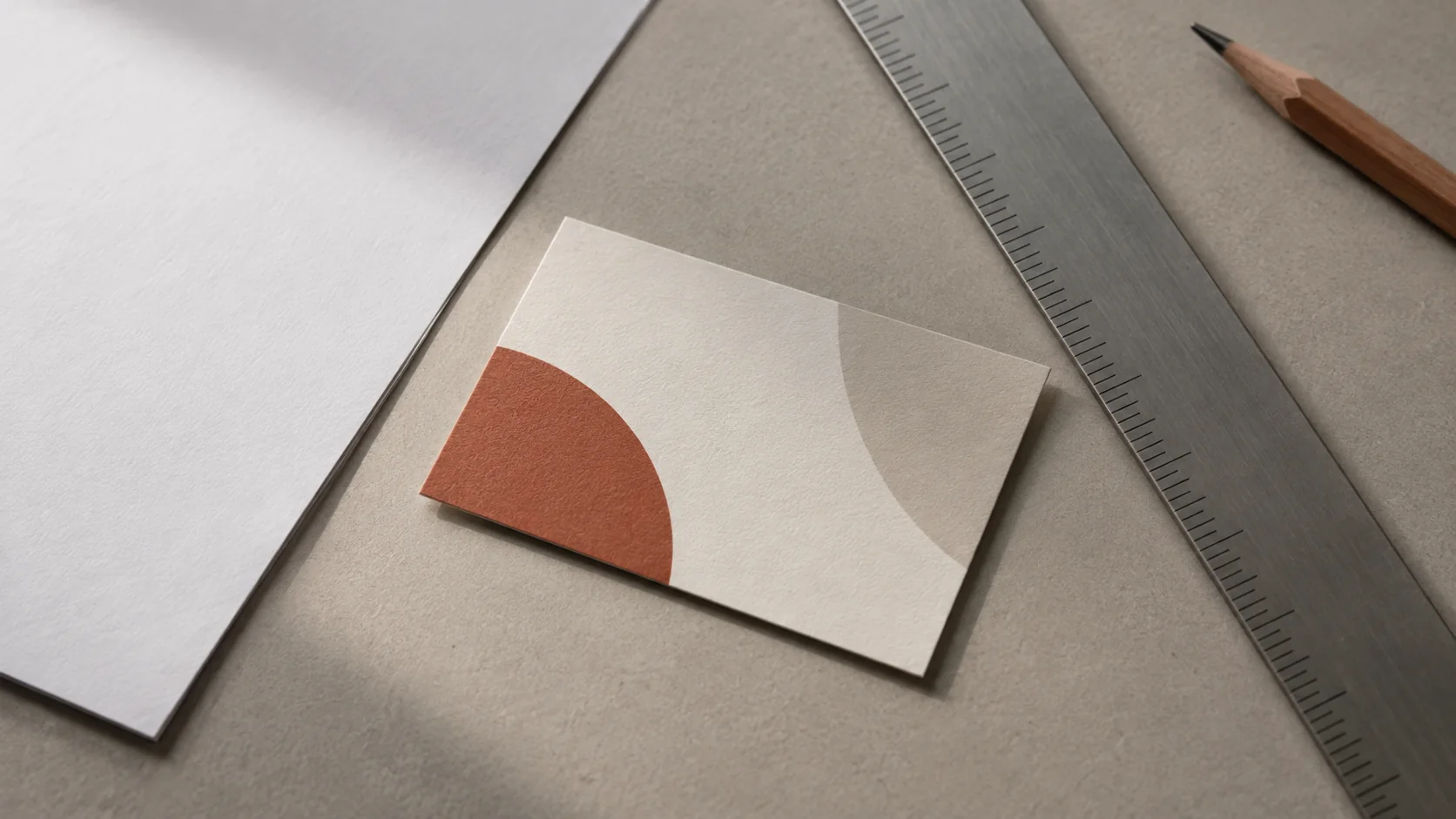
When the design is done, it does not have to live only on paper. The same visual can anchor an email signature, invoice header, or social profile banner. Generate matching variations with the same style pack so every touchpoint looks like the same business, then keep the real contact details as editable text in each destination.
Open the business card maker in kublaro's studio, describe your profession and brand, and use the first batch as a direction to refine. The goal is not to hand every design decision to the model. It is to get a useful visual foundation quickly, then make the small human decisions — what stays, what disappears, and what someone should remember — before the card leaves your desk.
Crie com kublaro
Descreva qualquer coisa e gere imagens incríveis em segundos; depois dê movimento com os melhores modelos de vídeo com IA.